A study project to improve visual design started by defining the website’s goals and intentions and then annotating website problems with the principle of design. After that, working on design development with choices of colours, typography and layouts aligning with their goals.
Task
Improve website visual design
Tools
FigJam
Figma
Illustrator
Photoshop
About
A study project to improve visual design started by defining the website’s goals and intentions and then annotating website problems with the principle of design. After that, working on design development with choices of colours, typography and layouts aligning with their goals.
Overview
Task
Improve website visual design
Tools
FigJam
Figma
Illustrator
Photoshop
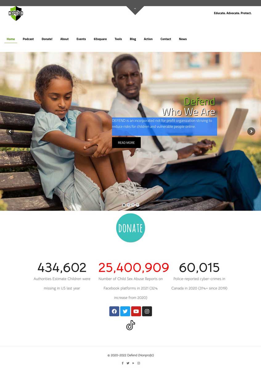
Web Page Evaluation
DEFEND is a non-profit organization that wants to raise awareness among parents about protecting children and other vulnerable people online.
Problems
Unorganized information architecture
Inconsistent colours and typefaces
Unclear hierarchy
Too much contrast
Imbalance layouts and density
Visibility doesn’t match their goal; it’s pressuring and overwhelming.
About the Organization
Goals
Protect children and vulnerable people on social media
Educate parents to educate children and watch out for their children
Understand the problem and donate to support the organization
Intentions
Educating and supporting
Grab attention and raise awareness
Interesting and clear
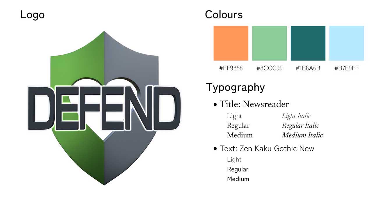
Style Guide
Colour Palette
Analogous Colours with a single complementary
Intentions
Green and blue represent educating and supporting
Orange represents grabbing attention and raising awareness
Typography
Title
Text
Intentions
Contrasting between title and text to meet the website goals
Newsreader is a serif typeface; trying to connect to users with a human-like typeface.
Zen Kaku Gothic New is a sans serif typeface; showing the formality with mechanical because this is a serious topic, but with the wider letters, it delivered a warm and welcoming feel.
Design Decision
Dividing sections with each page information on the home page for logical path and easy navigation; starting by telling a bit about the organization, guiding users to see the importance of this problem then suggesting actions that users can do to help
Using navigation components that are interactive throughout the web; learnable, predictable and efficiency
Using grids to improve alignments
Using container components to create gestalts
Contrasting colours and typography to balance the layouts, create hierarchies and readability
Using input control components to receive users’ information and connect with users
Emphasizing the parts that need attention to meet the organization’s goals
Making scannable pages with clean information architecture
Organizing pages with different patterns to create rhythm
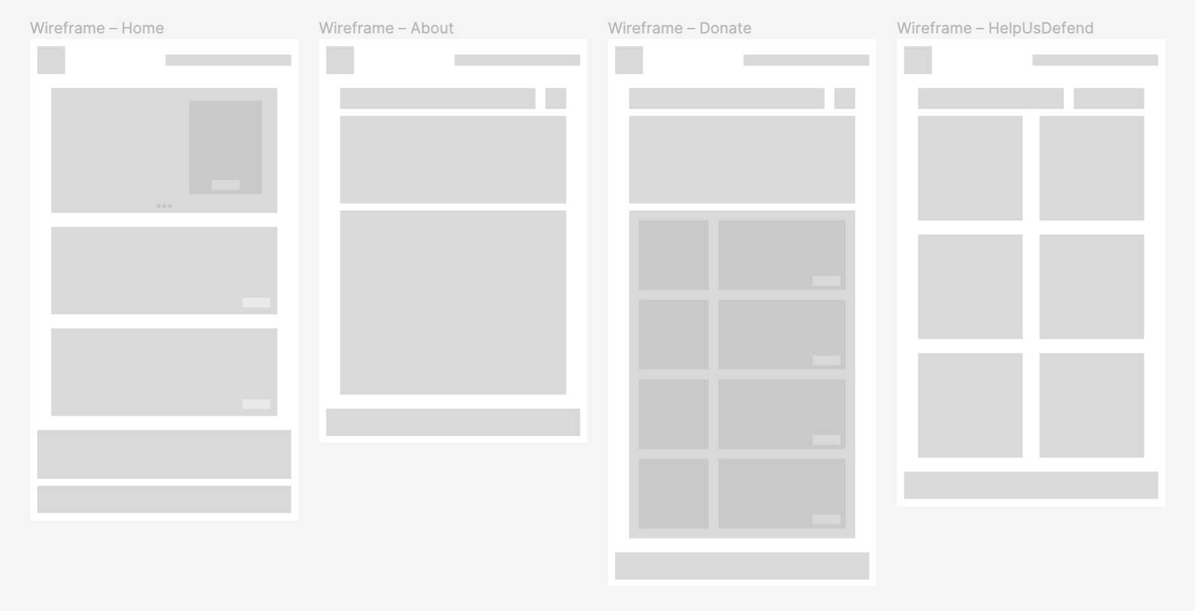
Low Fidelity Wireframes
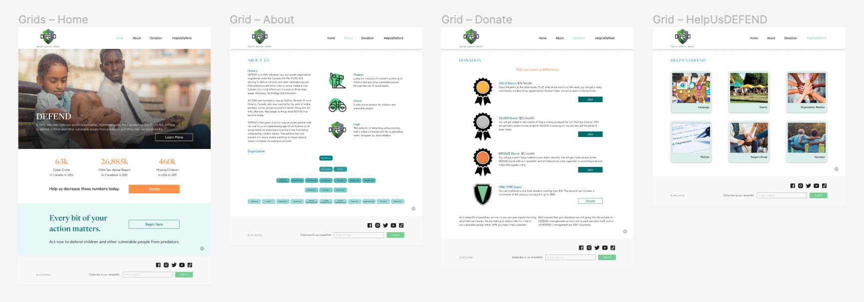
High Fidelity Wireframes
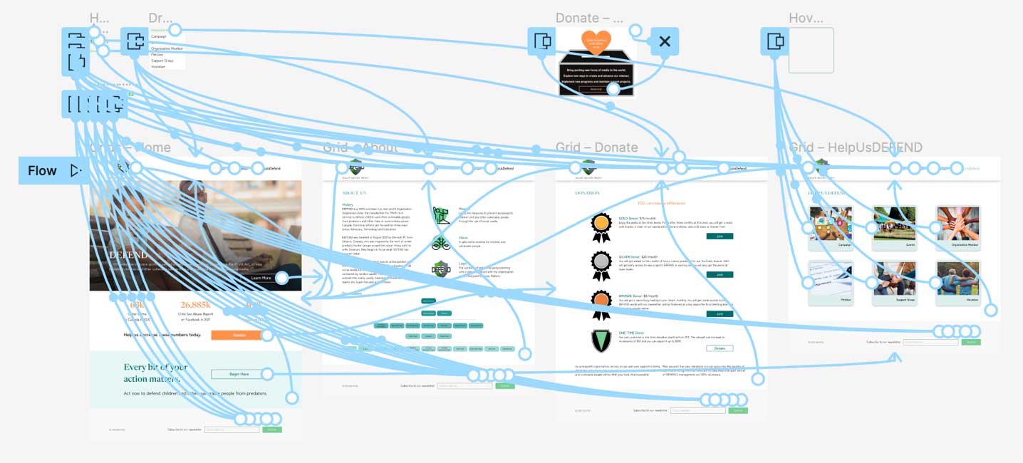
Prototype
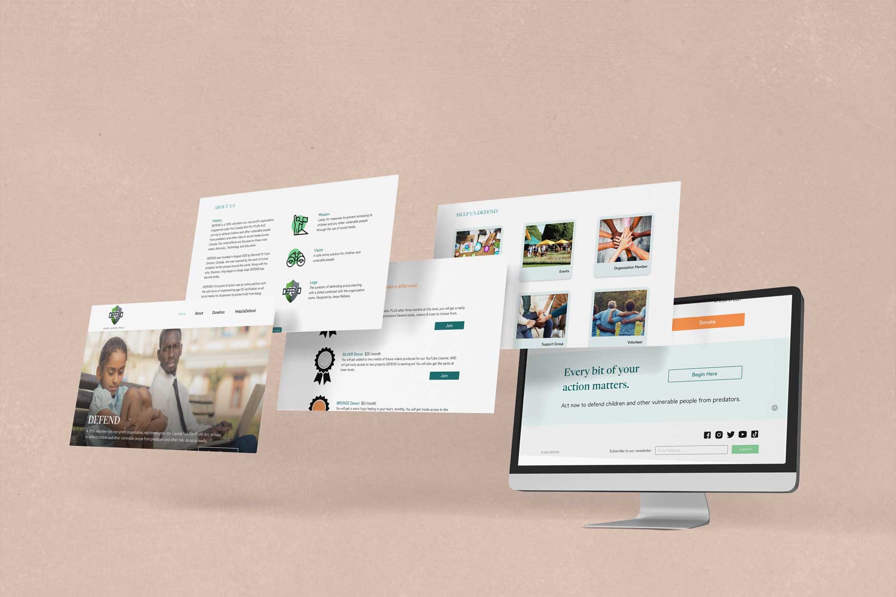
User Testing
Users could understand the goal of the website clearly from the hero image.
Users understand that the organization needs support from donations.
Users know what the organization will do after receiving donations.
The website has clear information, great pattern arrangement, and appropriate elements.
The website is informative, positive, and straight to the point.
The navigation is simple, clear, and predictable.
The pattern has learnability; common placement compared with other websites.
The overall design is smooth, attractive, and users friendly; got their attention but didn’t scare them away.
Users suggest that the organization tree is clear and transparent but could be better with members’ photos, and it could be better if the home page has more pictures from previous activities.

